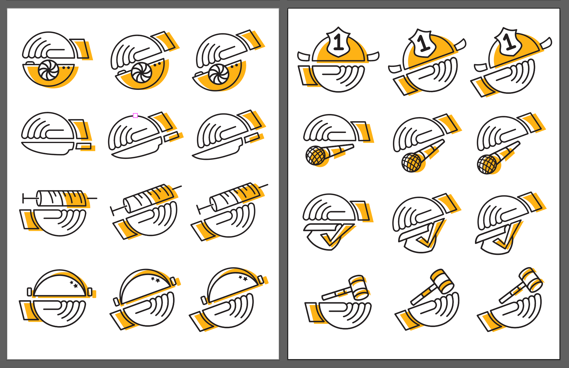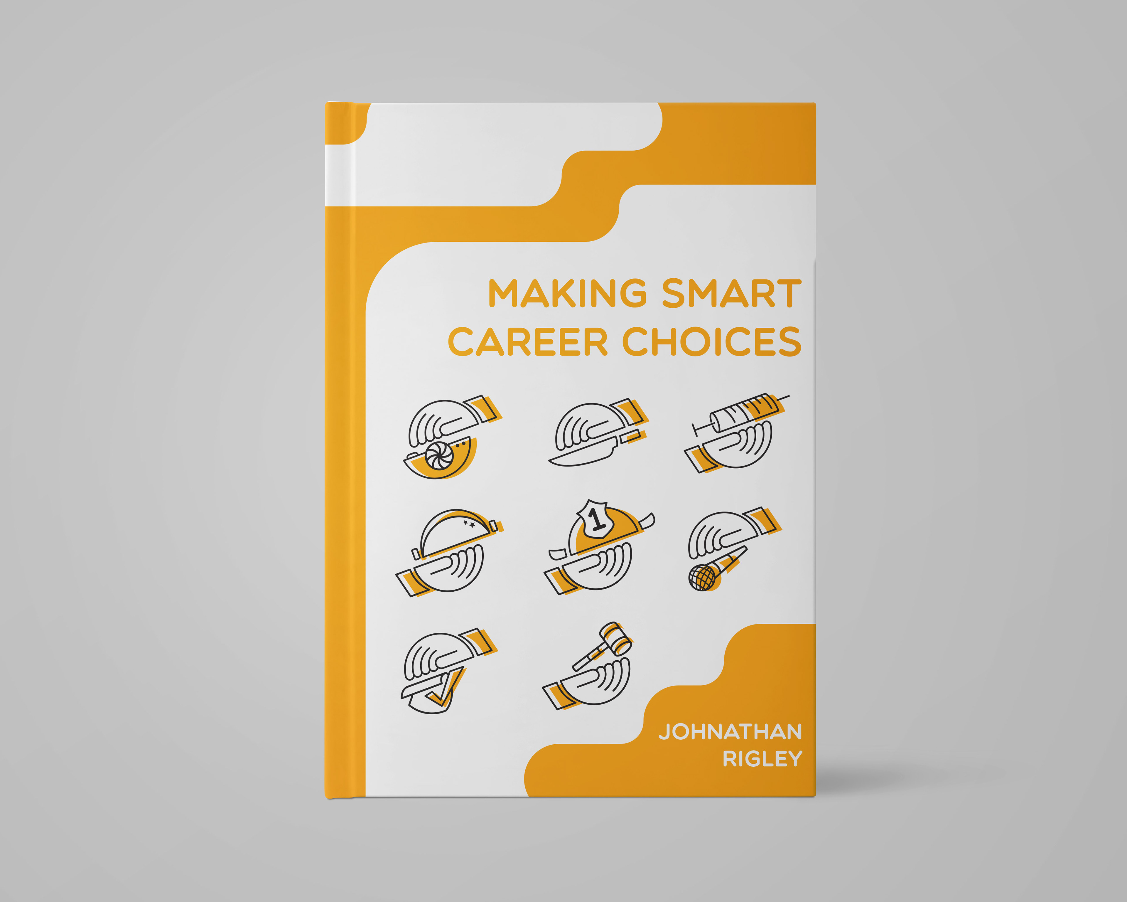

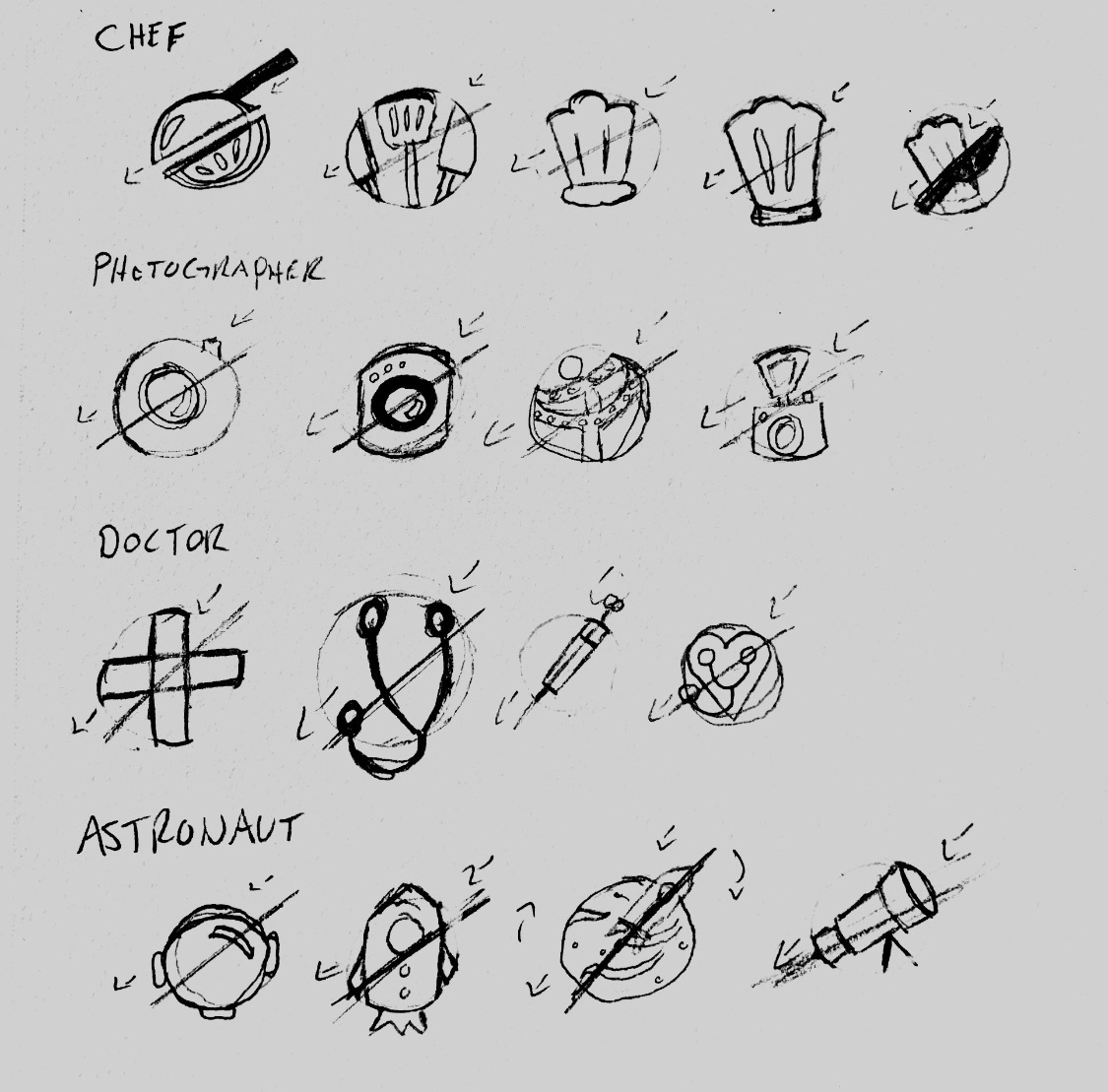
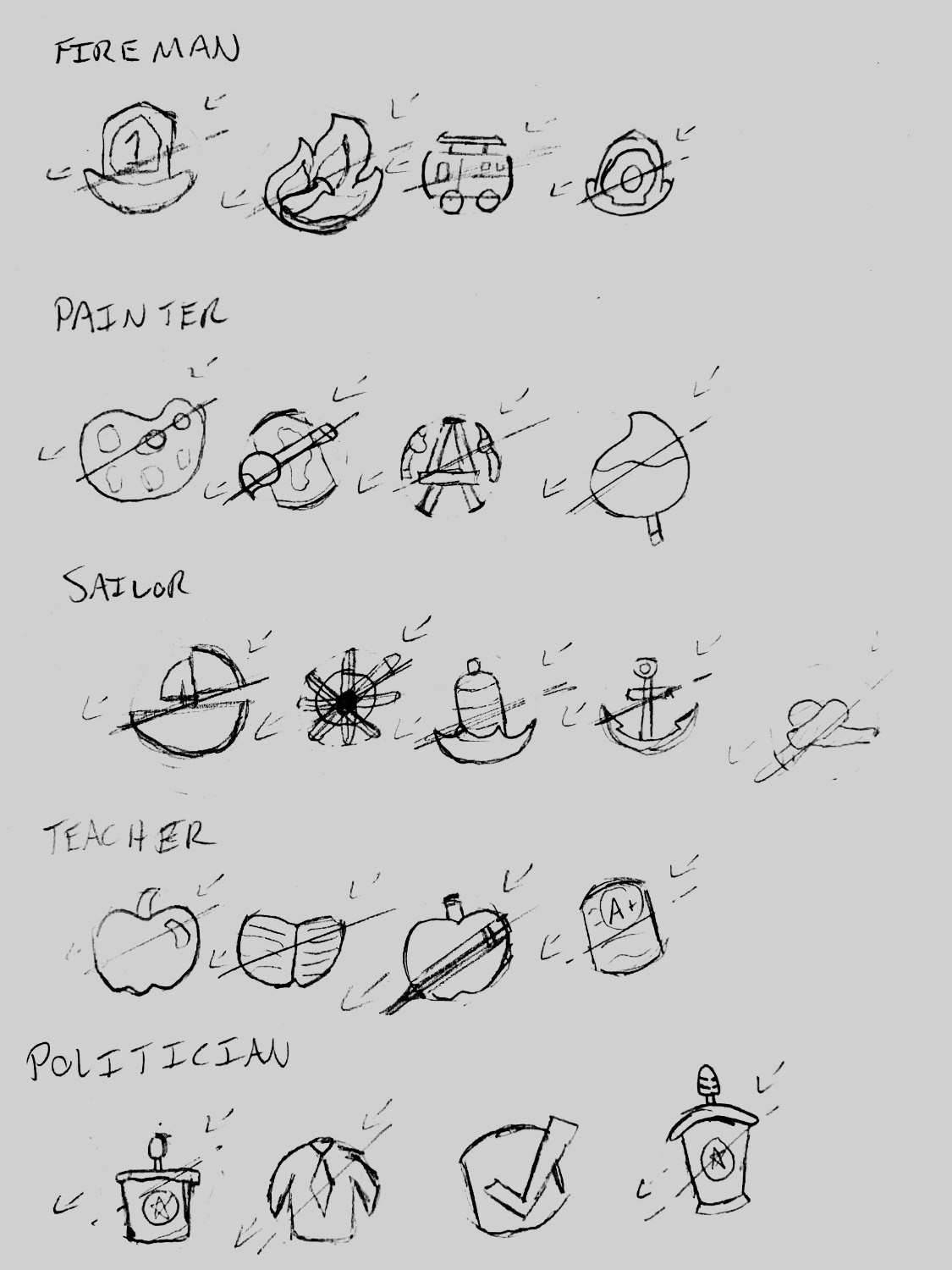
The development of profession-based icons was an exercise in my Image and Color class. We were tasked to develop a set of icons that represented the subject matter while also following a consistent style so that these could be used as a set.
I focused on a circular design, and eventually decided on splitting that circle in half and offsetting the halves for a unique look.
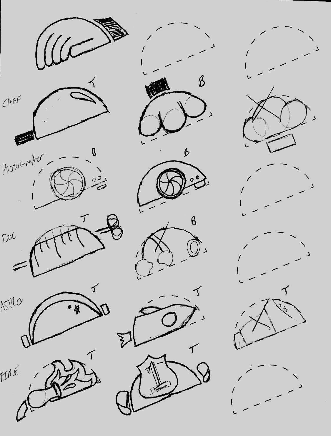
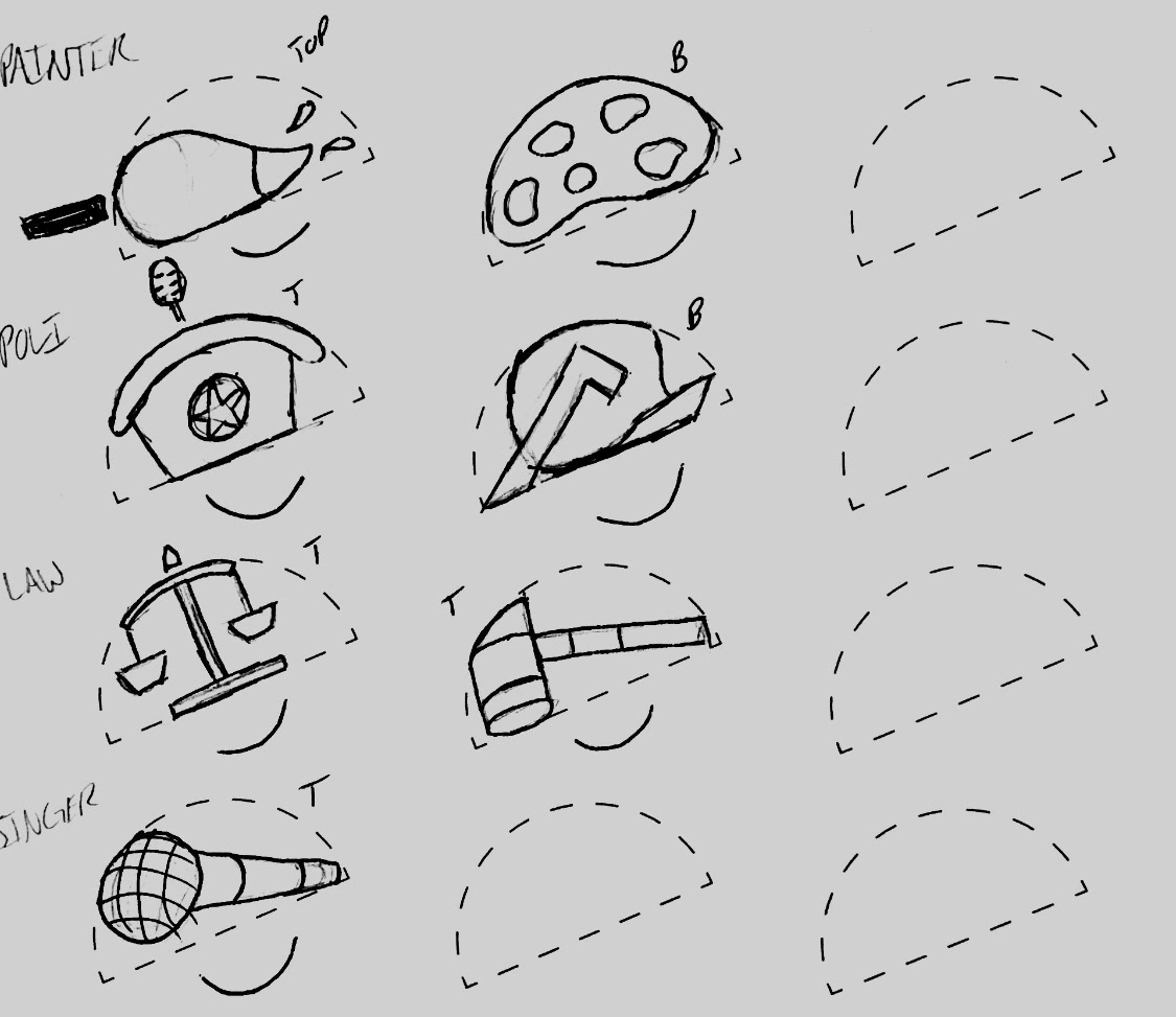
I then played with how I would disperse the color in these icons to balance them as a whole alongside their individual parts, before I finally settled on the final design, presented in a book cover format.